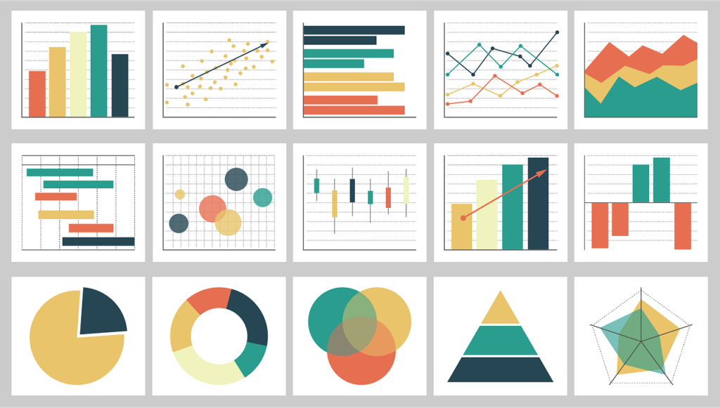
Data professionals can now create captivating data-driven tales that effectively communicate complicated information to a wider audience because of the ongoing development of data visualization techniques and technologies. Some of the most recent methods and resources for data visualization are listed below:
- Interactive Data Visualization: By enabling users to examine data dynamically, interactive data visualizations make it simpler to comprehend complicated relationships and patterns. Users can engage directly with the visual representation of the data to acquire deeper insights by using interactive features, such as filters, tooltips, zooming, and panning. In addition, D3.js, Plotly, Bokeh, and Tableau are well-known interactive data visualization libraries and tools.
- Augmented and Virtual Reality (AR/VR) Visualization: AR/VR technologies are being employed more frequently to create immersive visualizations of data. These technologies allow for a more immersive and engaging data visualization experience by allowing users to enter data environments and explore datasets in 3D space.
- Geospatial Visualization: Users can comprehend spatial patterns and trends by using geospatial data visualization techniques, which are frequently used to depict data on maps. In creating geospatial visualizations, programs such as ArcGIS, Mapbox, and Google Maps API are frequently used.
- Animated Data Visualization: Animated data visualizations are useful for illustrating patterns and alterations across time. Animations can simplify difficult information and aid in the telling of a tale. Animated visualizations can be made using libraries such as Flourish, DataWrapper, and Plotly.
- Storytelling Dashboards: These dashboards are becoming more and more well-liked. These dashboards take the viewer step-by-step to insights by guiding them through a data-driven narrative. Interactive and narrative-focused dashboards may be made with the help of programs like Tableau, Microsoft Power BI, and Google Data Studio.
- Data-Driven Illustrations & Infographics: To produce aesthetically pleasing and illuminating representations of data, infographics and data-driven illustrations integrate data visualization with graphic design. These graphics are created using data visualization libraries and design programs like Adobe Illustrator and Canva.
- Automated insights and natural language generation (NLG): NLG tools are used to provide textual summaries and insights based on data. These tools perform data analysis and generate narratives that are readable by humans, making complex data more approachable to a wider audience.
- Data Art and Data Sculptures: The field of art is also embracing data visualization. Data is being used by designers and artists to produce visually appealing representations of information, turning numbers and statistics into enthralling works of art or sculpture.
- Visualization of Mixed Data kinds: Cutting-edge methods are being utilized to mix different data kinds, like text, graphics, audio, and video in a single visualization. This multidimensional method aids in developing a more thorough and all-encompassing knowledge of difficult facts.
- Explainable Data Visualization: The demand for explainable data visualization has increased as AI and machine learning become more common. Techniques that make it easier to see how AI models think and make decisions are becoming more popular.
In reality, the subject of data visualization is constantly developing, with new methods and devices appearing to deal with the difficulties of successfully conveying complicated information. These cutting-edge visualization techniques, together with the development of interactive and immersive technology, are enabling data specialists to create data-driven stories that captivate and educate audiences from a variety of backgrounds.

